Tuesday, December 20, 2005
Styling the LibraryThing Blog Widget
LibraryThing users have the ability to paste a widget into a blog template, thus allowing users to see a list of what they're reading, or a random selection, or a list of top tags or top authors from their LibraryThing collection. Tim (aka "the LibraryThing guy") has provided three pre-determined styles but there's also the ability to select "Don't style it (I'll style it with CSS)". Upon generating the code, you will see this note:
Simply put, it means you can use your own colors and fonts and what not to customize the output of the script that Tim provides. The code you can't see—the HTML code dynamically generated by Tim's JavaScript/PHP widget code—is marked up using CSS classes such as .LTwrapper and the others listed above. If you put definitions for these classes in the stylesheet section of your blog template, then voila—a customized LibraryThing widget display.
Classes? Stylesheet? The...what now?
In short, stylesheets enable you to create your own set of presentation rules for HTML tags, classes, and other elements. By creating a thorough stylesheet, you can rest assured that the content you surround with specific tag pairs will always look the same. In this case, once you define the .LTwrapper (etc) classes in your stylesheet, they will display in the same manner each time they're used.
Stylesheet rules consist of two parts: the selector, which can be a tag name, an identifier name, or a class name, and the declaration, which describes exactly how the selector should appear. Take, for instance, the standard <b></b> tag pair. If you wanted to ensure that all text within this tag pair was always displayed in a red, bold, Verdana font, you would use the following rule:
The three items within the rule listed above—color, font-weight, and font-family—are called properties, whereas "#FF0000," "bold," and "Verdana" are the values of the properties. Notice that the rule for the <b></b> tag pair does not have any information related to font size. In this instance, the font size will be inherited from whatever element the content is contained within. For instance, if font size information is indicated at the paragraph level (e.g.for example, in the declaration for the <p></p> tag pair) and bolded text appears within a paragraph, the bolded text will also be the same font size as all the rest of the content in the paragraph.
You can see that it would be advantageous to declare as many constant variables at the highest level possible. For instance, if you know the base font family, font weight, font color, and font size for all the content in your document, define these items as part of the rule for the <body></body> tag pair:
Now we'll get back to the LibraryThing widget...
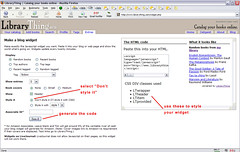 IMAGE 1: This is an example of the form you'll see when visiting the LibraryThing blog widget page. If you select "Don't style it" and then press the "see it" button, code will be generated and displayed on the right side of your screen. The code in the textarea (where it says "Paste this into your HTML") is the code you should cut and paste into your template, wherever you want the widget to appear. Below the textarea is the list of classes used.
[click to embiggen image]
Following are the style definitions I use, which produce the output shown in Image 2 (below).
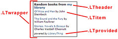 IMAGE 2: The .LTwrapper does what you'd expect given the name—it is the div wrapped around everything else. I've given mine a particular width (170px), a padding around its internal elements (4px on all sides), and a 1px solid black border. The .LTheader class is used for the first line, the one that says things like "Random books from my library" or "Top authors from my library" or whatever else you've chosen to show. I haven't done anything terribly special with this class, except bold it and make the text 11px. Remember, unless specifically named in the definitions, the style will inherit other attributes from the overall body tag or whatever other container tag it is within. This is why the font family shown here is the same as the font family used in the rest of my blog template. The .LTitem class is just normal font weight and 9px, but I've also used some padding elements just as I have with .LTprovided, which is also italicized in addition to being normal font weight and 9px.
A word about the padding values, because I show two different usages here: "4px" and "3px 0px 3px 0px". If you want the same padding (or border, or margin) values on all four sides of an object, you need only declare the one value, e.g. "padding: 4px". But if you want 3px on the top and bottom and no padding on the left and right sides, use "3px 0px 3px 0px". This follows the "trouble" mnemonic device: Top, Right, Bottom, Left == TRBL == "trouble". You could use the four distinct styles such as padding-top, padding-right, padding-bottom, padding-left but that's three extra of typing/maintaining.
[click to embiggen image]
To futher demonstrate how you really can custommize these styles however you want, I offer this horrible example:
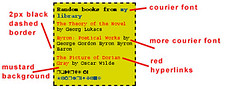 IMAGE 3: Oh my. Well, here you can see a different border (2px dashed) and background color (#D9D600, or "mustard-ish") defined in the .LTheader style. Differences to the other styles have to do with font families (Courier, Zapf Dingbats) and sized. But you'll see I also added a new style: ".LTitem a". This style will be used for all a tags (links) within the .LTitem div. As you can see in the definition, the color for this style is "#ff0000," aka "red". I use the "border: none" definition to wipe out the "border-bottom: dashed" style I use for other a-related styles in my template.
[click to embiggen image]
Now go forth and customize!
Oh wait. Remember to backup your blog template before making changes, so you can paste it back if need be. Also, Blogger users (and I presume users of other blog platforms but I don't know because I don't use 'em) can change your template and press the "Preview" button to your heart's content, without saving anything. This allows you to tweak your custom styles until you have them just so, before saving your template and republishing your blog. Also remember, you don't have to republish your entire blog if your LibraryThing blog widget is only on the main page—you can republish index only and you'll be all good.
NOW go forth and customize!
****************************
Update: LibraryThing user Mark reminds us (well, me) that you can style the book cover images as well, if you select
"Small" or "Medium" for the "Book covers" question in the widget form. He uses these styles:
technorati tag: librarything
go to main page
LibraryThing users have the ability to paste a widget into a blog template, thus allowing users to see a list of what they're reading, or a random selection, or a list of top tags or top authors from their LibraryThing collection. Tim (aka "the LibraryThing guy") has provided three pre-determined styles but there's also the ability to select "Don't style it (I'll style it with CSS)". Upon generating the code, you will see this note:
CSS DIV classes usedAll well and good, you say, but what does that mean to me?
* LTwrapper
* LTheader
* LTitem
* LTprovided
Simply put, it means you can use your own colors and fonts and what not to customize the output of the script that Tim provides. The code you can't see—the HTML code dynamically generated by Tim's JavaScript/PHP widget code—is marked up using CSS classes such as .LTwrapper and the others listed above. If you put definitions for these classes in the stylesheet section of your blog template, then voila—a customized LibraryThing widget display.
Classes? Stylesheet? The...what now?
In short, stylesheets enable you to create your own set of presentation rules for HTML tags, classes, and other elements. By creating a thorough stylesheet, you can rest assured that the content you surround with specific tag pairs will always look the same. In this case, once you define the .LTwrapper (etc) classes in your stylesheet, they will display in the same manner each time they're used.
Stylesheet rules consist of two parts: the selector, which can be a tag name, an identifier name, or a class name, and the declaration, which describes exactly how the selector should appear. Take, for instance, the standard <b></b> tag pair. If you wanted to ensure that all text within this tag pair was always displayed in a red, bold, Verdana font, you would use the following rule:
b {
color: #FF0000;
font-weight: bold;
font-family: Verdana;
}
You could also write the rule on one line:color: #FF0000;
font-weight: bold;
font-family: Verdana;
}
b {color: #FF0000; font-weight: bold; font-family: Verdana;}
Rules written on multiple lines and in an indented style are much easier to read, but if you prefer your rules all on one line there's no detrimental effect.The three items within the rule listed above—color, font-weight, and font-family—are called properties, whereas "#FF0000," "bold," and "Verdana" are the values of the properties. Notice that the rule for the <b></b> tag pair does not have any information related to font size. In this instance, the font size will be inherited from whatever element the content is contained within. For instance, if font size information is indicated at the paragraph level (e.g.for example, in the declaration for the <p></p> tag pair) and bolded text appears within a paragraph, the bolded text will also be the same font size as all the rest of the content in the paragraph.
You can see that it would be advantageous to declare as many constant variables at the highest level possible. For instance, if you know the base font family, font weight, font color, and font size for all the content in your document, define these items as part of the rule for the <body></body> tag pair:
body {
font-family: Verdana, Arial, Helvetica, sans-serif;
font-weight: normal;
font-size: 12px;
color: #000000;
background-color: #FFFFFF;
}
But alas, I digress (and cut and pasted from Appendix B, "CSS Fundamentals," of my book. The rest of the appendix goes on to describe examples of many types of properties, so see what you're missing?? I kid, I kid. You can also learn CSS basics in this Webmonkey guide or from the W3C.font-family: Verdana, Arial, Helvetica, sans-serif;
font-weight: normal;
font-size: 12px;
color: #000000;
background-color: #FFFFFF;
}
Now we'll get back to the LibraryThing widget...
IMAGE 1: This is an example of the form you'll see when visiting the LibraryThing blog widget page. If you select "Don't style it" and then press the "see it" button, code will be generated and displayed on the right side of your screen. The code in the textarea (where it says "Paste this into your HTML") is the code you should cut and paste into your template, wherever you want the widget to appear. Below the textarea is the list of classes used.[click to embiggen image]
Following are the style definitions I use, which produce the output shown in Image 2 (below).
.LTwrapper {border: 1px solid black; padding: 4px; width: 170px; float: left}
.LTheader {font-weight:bold;font-size:11px;}
.LTitem {font-weight:normal;font-size:9px; padding: 3px 0px 3px 0px;}
.LTprovided {font-weight:normal; font-style: italic; font-size:9px; padding: 3px 0px 3px 0px;}
.LTheader {font-weight:bold;font-size:11px;}
.LTitem {font-weight:normal;font-size:9px; padding: 3px 0px 3px 0px;}
.LTprovided {font-weight:normal; font-style: italic; font-size:9px; padding: 3px 0px 3px 0px;}
IMAGE 2: The .LTwrapper does what you'd expect given the name—it is the div wrapped around everything else. I've given mine a particular width (170px), a padding around its internal elements (4px on all sides), and a 1px solid black border. The .LTheader class is used for the first line, the one that says things like "Random books from my library" or "Top authors from my library" or whatever else you've chosen to show. I haven't done anything terribly special with this class, except bold it and make the text 11px. Remember, unless specifically named in the definitions, the style will inherit other attributes from the overall body tag or whatever other container tag it is within. This is why the font family shown here is the same as the font family used in the rest of my blog template. The .LTitem class is just normal font weight and 9px, but I've also used some padding elements just as I have with .LTprovided, which is also italicized in addition to being normal font weight and 9px.A word about the padding values, because I show two different usages here: "4px" and "3px 0px 3px 0px". If you want the same padding (or border, or margin) values on all four sides of an object, you need only declare the one value, e.g. "padding: 4px". But if you want 3px on the top and bottom and no padding on the left and right sides, use "3px 0px 3px 0px". This follows the "trouble" mnemonic device: Top, Right, Bottom, Left == TRBL == "trouble". You could use the four distinct styles such as padding-top, padding-right, padding-bottom, padding-left but that's three extra of typing/maintaining.
[click to embiggen image]
To futher demonstrate how you really can custommize these styles however you want, I offer this horrible example:
.LTwrapper {border: 2px dashed; padding: 5px; width: 150px; float: left; background: #D9D600;}
.LTheader {font-weight:bold; font-size:12px; font-family: Courier;}
.LTitem {font-family: Courier; font-weight:normal; font-size:10px; padding: 3px 0px 3px 0px;}
.LTitem a {font-family: Courier; font-weight:normal; font-size:10px; padding: 3px 0px 3px 0px; color:#ff0000; border: none;}
.LTprovided {font-family: ZapfDingbats; font-weight:normal; font-size:10px; padding: 3px 0px 3px 0px}
IMAGE 3: Oh my. Well, here you can see a different border (2px dashed) and background color (#D9D600, or "mustard-ish") defined in the .LTheader style. Differences to the other styles have to do with font families (Courier, Zapf Dingbats) and sized. But you'll see I also added a new style: ".LTitem a". This style will be used for all a tags (links) within the .LTitem div. As you can see in the definition, the color for this style is "#ff0000," aka "red". I use the "border: none" definition to wipe out the "border-bottom: dashed" style I use for other a-related styles in my template. [click to embiggen image]
Now go forth and customize!
Oh wait. Remember to backup your blog template before making changes, so you can paste it back if need be. Also, Blogger users (and I presume users of other blog platforms but I don't know because I don't use 'em) can change your template and press the "Preview" button to your heart's content, without saving anything. This allows you to tweak your custom styles until you have them just so, before saving your template and republishing your blog. Also remember, you don't have to republish your entire blog if your LibraryThing blog widget is only on the main page—you can republish index only and you'll be all good.
NOW go forth and customize!
****************************
Update: LibraryThing user Mark reminds us (well, me) that you can style the book cover images as well, if you select
"Small" or "Medium" for the "Book covers" question in the widget form. He uses these styles:
.LTitem {float:left; margin-top:1em}
.LTitem img {float:right; margin-left:1em}
Note the use of "float: left" and "float: right" which puts the author info on the left and the image on the right. Swapping the float values would produce the opposite effect. You could also throw a border value into the image tag, something like "border: 1px solid black" and so forth, or some padding around the image, to ensure that the text and image are visually set apart from each other..LTitem img {float:right; margin-left:1em}
technorati tag: librarything
go to main page
